
Why averaging PPI scores won't work >
By Frank Ballard
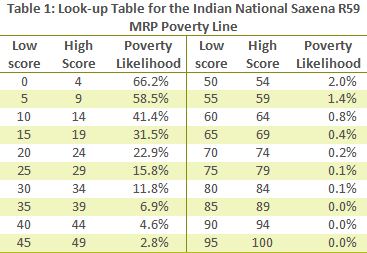 The reason that scores can't be averaged when determining a poverty rate is that scores are simply ordinal markers. Every score belongs to a score range (e.g., 0-4, 5-9), which in turn is associated with a poverty likelihood. Scores must be converted into a poverty likelihood before one can state that a poverty measurement has been made. While it's true that increasing the value of a score enough that it moves to the next highest score range will lead to a lesser likelihood of poverty rate, the amount that the likelihood decreases when moving from one range to another is not constant over all score ranges. For example, in Table 1 we see that increasing a score's value by ten will have a different impact on poverty likelihood when the initial score is 0 (the poverty likelihood would decrease by 24.8%) than when it is 90 (there would be no measurable change in likelihood at all).
Averaging scores will actually lead to a lower poverty rate in most situations than would calculating scores correctly. The only situation in which the rates will be the same using both the incorrect and correct methods is if all of the scores are within the same range (or a range of scores with the same likelihood, such as 85 – 100, all of which leads to a likelihood of 0%). This is because the average of the scores would belong to the same range, so all derived likelihoods would be equal.
Example
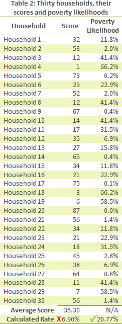 Table 2 shows a list of thirty househoulds, their scores from the PPI survey and the associated poverty likelihoods for those scores. The average score for these households is 35.3. If we were to determine the poverty rate by looking up the associated likelihood of this average, we would incorrectly determine that the poverty rate is 6.90%.
Just how incorrect is this poverty rate? The actual poverty rate, found by averaging all poverty likelihoods, is 20.77%. This is 13.87 percentage points higher than what we determined using the average of scores. Therefore, in this instance, the incorrect rate is less than a third of the actual rate. That’s quite a difference!
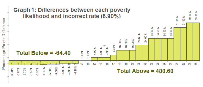
Continuing with this example, we can show that an imbalance exists in the differences between each of the household poverty likelihoods and the incorrect poverty rate, 6.90%. Graph 1 (below) plots these differences, ordered from least to greatest.
Notice that the space of the bars above the X-axis is greater than the space of the bars below the X-axis. If the poverty rate were correct (i.e., the average of all poverty likelihoods), then the space below the X-axis would be equal to the space above it. This is because an arithmetic average is the point at which the total negative differences and total positive differences between likelihoods balance.
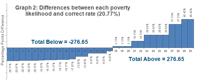
Looking at Graph 2, which plots the differences between the correct poverty rate, 20.77%, and each poverty likelihood, ordered from least to greatest, we see that there is balance.
To learn more about finding the rate of poverty in a group using the PPI, see our presentation Calculating Poverty Rates.
Download this blog post in Spanish.


Comments